 Home Weather StationsAHome Weather StationsA
Open any weather or popular science magazine and you will find several ads for state-of-the-art affordable weather stations. Combined with sophisticated software, weather data can now be collected every minute and displayed on your computer in real time in striking customized graphic formats (figure 16.1). All that is required is sufficient open space between your house and your weather sensors (figures 16.2. and 16.3). Many stations are sold in wireless versions, thus simplifying installation. The accuracy of these sensors usually falls within a degree or two, depending on temperature or within five percent of actual relative humidity. This equipment however provides enough accuracy to ensure a good quality climate dataset over time. The good news about the data is that it can be collected and stored (i.e., simple data logger (Figure 16.4)) for long periods without the need to have your computer on 24/7. Downloading this record to your computer’s hard drive is as simple as a matter of a few clicks with your mouse.
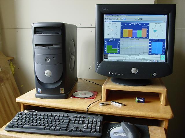
Figure 16.1. Weather station computer monitor
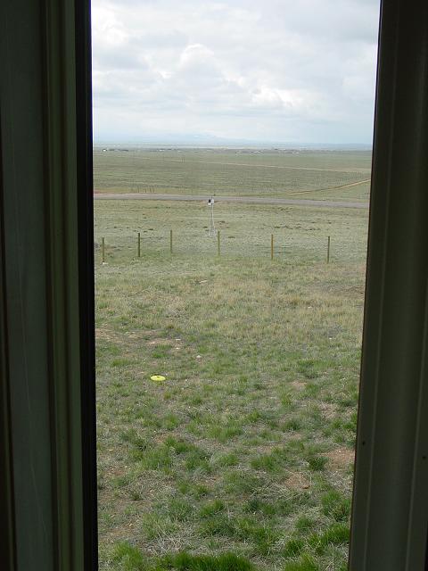
Figure 16.2. Weather station looking west from inside my house
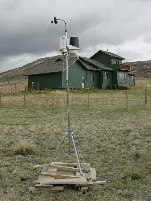
Figure 16.3. Weather station looking east towards house
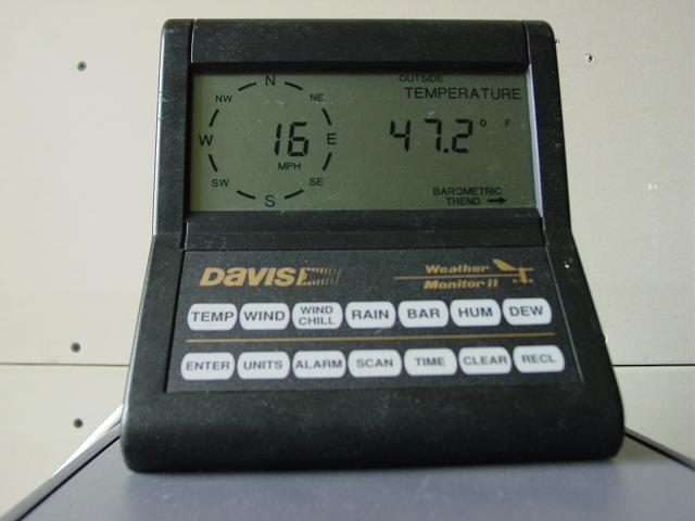
Figure 16.4. Davis Instruments weather logger
Unlike daily weather station records from the National Weather Service that are summarized hourly on the internet, higher frequency weather data from home weather stations provide interesting and perhaps important clues as to the characteristics of local (micro) weather and climate. For example, how does local terrain effect wind turbulence (gustiness) and wind direction? Does the times of daily wind shifts relate to valley-mountain breezes? How is temperature a function of cloud cover or wind speed? Just how strong was that cold front that moved through your area? Over time these relationships can be modeled in terms of a simple statistical relationship. Wouldn’t it be interesting to know how much variation in average wind speed verses maximum gusts are during various time intervals and if this relationships vary over time?
Of course, with 1440 minute observations per day, one would acquire over half a million values for temperature, humidity, pressure, wind direction and speed, and precipitation in a year. To manage these large datasets, computer spreadsheets (i.e., EXCEL) become essential. In the next section, examples of the different ways weather data that can be plotted are shown. While the relationships between weather elements can seem endless, nature does provide some clues (e.g., causes and effects) as to how our atmosphere works. Exploring this part of nature is challenging but also a lot of fun.
Home weather stations usually have a basic array of sensors. These include outside temperature, humidity, wind, and pressure components. For additional cost, one can easily add a precipitation gauge, radiometer (measures solar energy), soil temperature and moisture probes, and indoor temperature and humidity instruments. From these data, derived weather elements (e.g. dew point temperature, heat index, wind chill index, resultant wind directions, etc.) can also be acquired. While plotting data in a time series is typically the way it is summarized, knowing how often, say the temperature reaches or exceeds 50 degrees, can also prove useful, especially when planting is concerned. The examples that follow are just a small sample of ways that weather data can be displayed and ultimately use.
My dedicated “weather” computer and data logger are located in my unheated basement with only a southwest facing window to heat the area during the late afternoon. As noted in figure 16.5, the indoor and outdoor temperatures tend to lag one another. The basement must be well insulated because the daily and monthly temperature range varied little and appears to not be greatly influenced by large temperature fluctuations and extremes that occurred outside. This effect is to be expected since the basement is mostly in the ground where deeper ground temperature varies little throughout the year. Caves usually maintain a near constant temperature year round and hover near the annual average outside temperature provided that there is no significant exchange of inside and outside air.
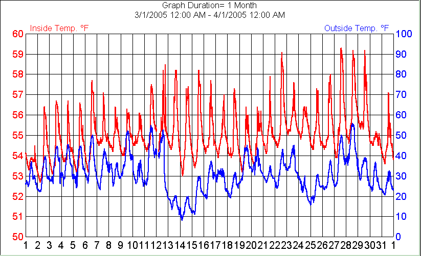
Figure 16.5. Example of a time series of indoor and outdoor temperatures
In figure 16.6, the frequency of outside temperatures for March 2005 as taken on the minute, five, 10, 15, 20, 30, and 60 minute marks reveals little variation within each temperature bin. Of course, taking readings only once per hour will miss minor variations in temperature within that hour, but still it is interesting that variation in frequency between one and 60 minutes is usually within a two percent range.
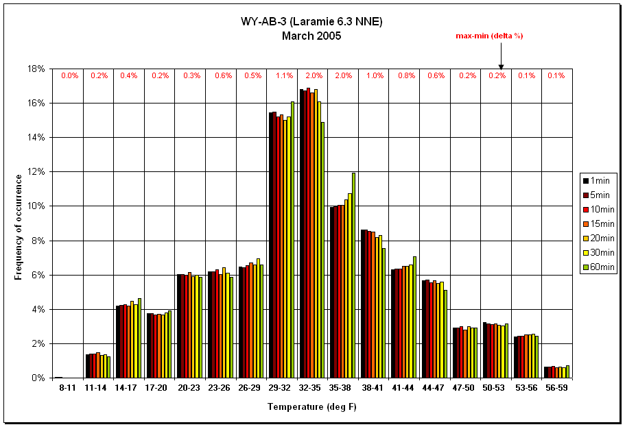
Figure 16.6. Example of integrated outside temperatures from one to 60 minute readings in three degree F bins
To illustrate this point further, Table 16.A shows how taking the traditional average daily temperature (i.e. (maximum + minimum)/2) is actually a close approximation to taking temperatures every minute or every hour and averaging the results. The integrated temperatures on the 8th and 20th of April show the greatest departures from the normal average temperature. During the month, these differences are less than half a degree on average (cooler in this case). There are several factors that cause these differences but over time could signal a change in cloud cover or wind speed. Figure 16.6a shows this graphically and compares March and April 2005 integrated temperatures compared to standard daily average temperatures.
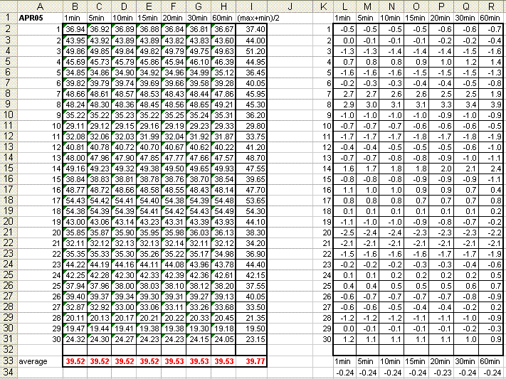
Table 16.A. Daily average integrated temperature (one to 60 minutes) and their departures from average daily temperatures
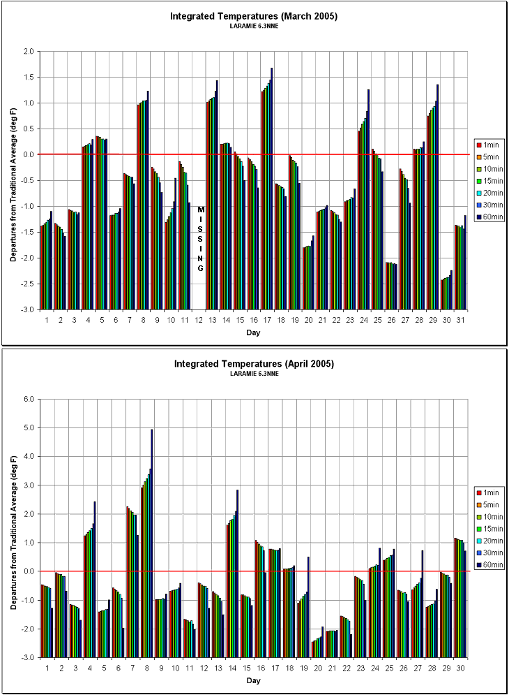
Figure 16.6a. Comparison of integrated temperatures from one to 60 minutes for March and April 2005 at Laramie 6.3 NNE as compared to standard daily average temperature (max+min)/2.
Another interesting exercise when monitoring temperatures is timing of frontal passages. Temperatures can rise or fall several degrees within minutes and is usually, although not always accompanied by changing humidity, wind direction and strengthen, and pressure. In Table 16.B, the greatest temperature changes during March 2005 show that most occurred as temperature falls. During the greatest event on March 12, the minute by minute changes first occurred in wind direction followed shortly by temperature and humidity.
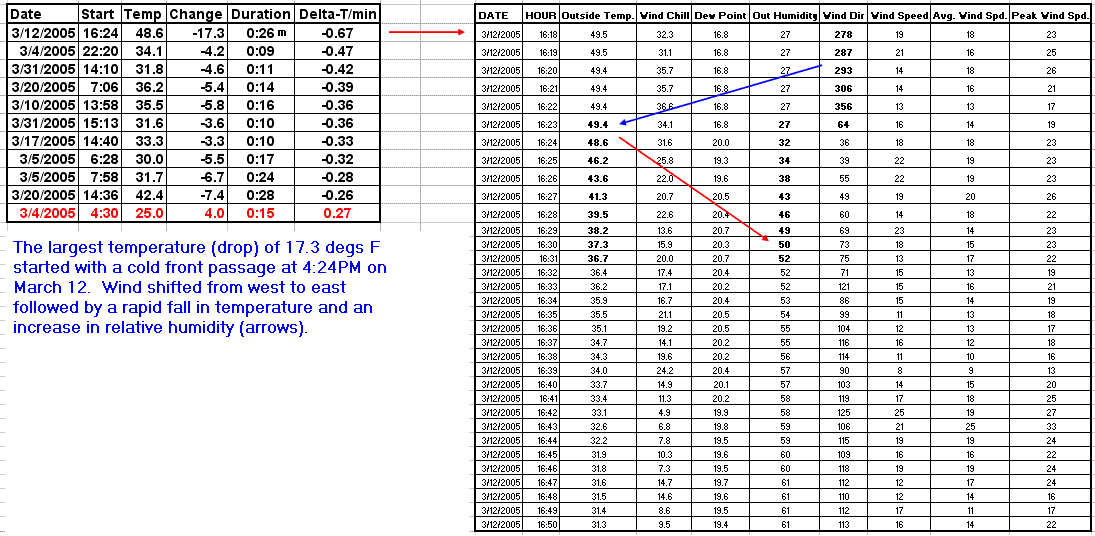
Table 16.B. Large short term temperature changes during March 2005 for WY-AB-3 (Laramie 6.3 NNE). Arrows follow changing weather elements.
In the Rocky Mountains, relative humidity is generally low throughout the year. In the summer, this condition allows for warm comfortable days and cool air condition free nights. During March, several weather systems move through Wyoming resulting in rapid shifts in humidity. As noted in Figure 16.7, integrated humidity values from one minute to one hour shows the highest frequency of values in the 60 to 65 percent bin. As with the integrated temperature chart (Figure 16.6), there is usually less than 0.5% difference between integrated values across the hour time sampling. In the 45 to 50 percent bin, the greatest difference (1.2%) between integrated periods probably reflects rapidly changing humidity from wetter to drier or vice versa. Note the rarity of extreme humidity events. This might be due in part to the humidity sensor’s accuracy at the ends of its measuring range (i.e. accuracy falls off dramatically in very dry air).
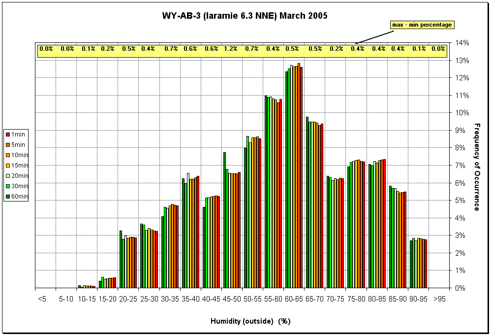
Figure 16.7. Example of integrated relative humidity from one to 60 minute readings in five percent bins
There are three types of wind speed measurements that are available with home weather stations. The first is simply the actual instantaneous wind on the minute. The second is the average wind over a given period of time (sampling approximately every 7.5 seconds with my station). The third is recording the highest peak gust during a given period, again sampled every 7.5 seconds. Statistics should show that approximately 12.5% of the time, the highest gust should fall on the minute. As noted in Figure 16.8, this approximation does indeed occur. However, the peak gust is usually a few miles per hour higher during a given minute than what is recorded on the exact minute. This distinction is noted because some data loggers cannot record average wind speeds and peak gusts or is depended on supporting software capabilities. My equipment cannot record some data except when the data is downloaded directly to my computer’s hard drive. To save on power, I generally keep my computer turned off unless I anticipate a strong windy period. My data logger is capable to storing about 1500 weather readings before downloading is required. This means that if I want one minute data, I need to download these data to my computer daily. If I collect one hour data, I don’t have to download the data logger for more than two months. The data logger is a reliable backup when there is a power outage (usually runs on 9-volt battery).
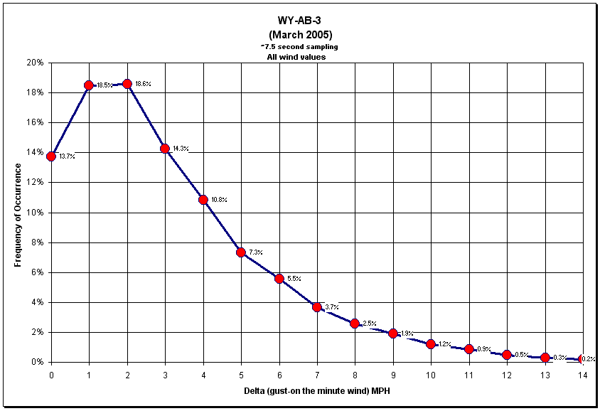
Figure 16.8. Frequency of peak gusts minus wind speed measured on the minute for March 2005 at Laramie 6.3 NNE
When comparing the difference of peak gusts verses average winds during a one minute period, it is interesting to note that peak winds and average winds are seldom equal. This suggests the turbulent nature of wind. In Figure 16.9, the graph shows that gusts are most frequently 2 mph higher than average winds although it is not uncommon for gusts to be 6 mph or higher than average winds. During the summer, thunderstorms and dry micro bursts caused gusts can be 20 or 30 mph more than the average winds for short periods.
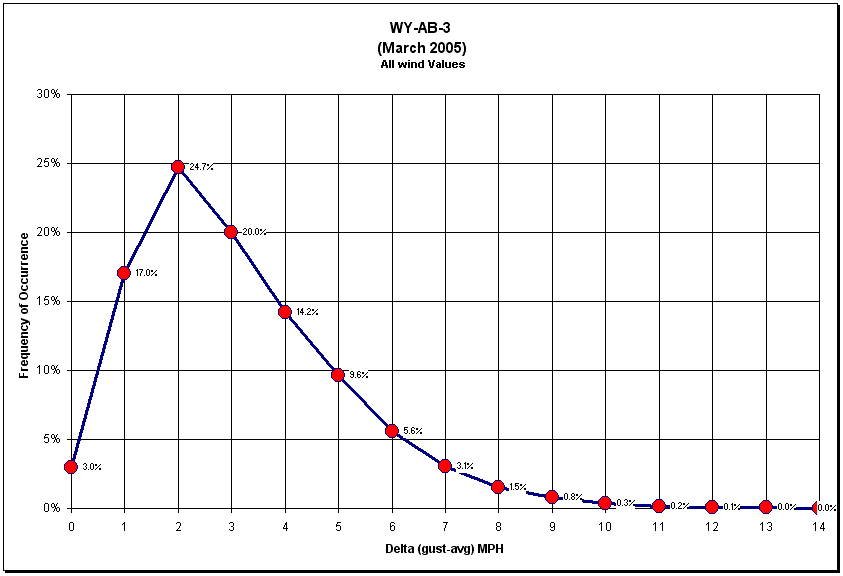
Figure 16.9. Frequency of peak gusts minus average one minute wind speeds for March 2005 at Laramie 6.3 NNE
However, in all fairness to statistics, Figures 16.8 and 16.9 were computed using all wind speeds. The NWS, on the other hand, defines a wind gust as "the maximum instantaneous speed in knots in the past 10 minutes ..." (when there is a rapid fluctuation "in wind speed with a variation of 10 knots or more between peaks and lulls."). Additionally, wind speed is defined as the "2-minute average speed in knots ...". Figure 16.9a attempts to better show this by using the minimum gust criteria of 12 mph or higher. However, one minute vice two minute winds were used in this example.
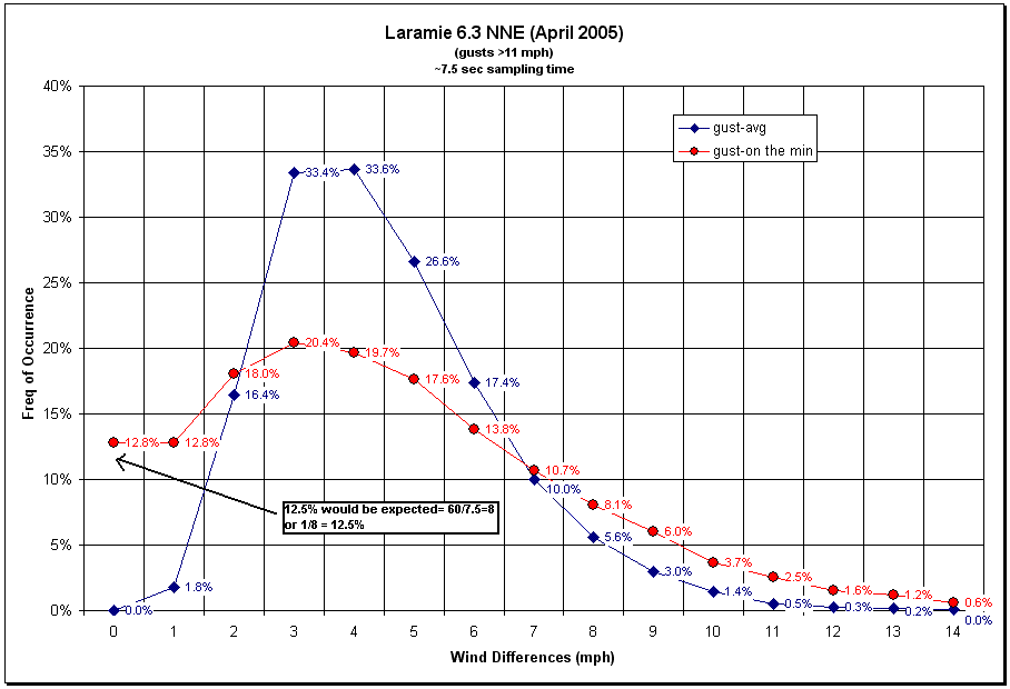
Figure 16.9a. Frequency of peak gusts minus average one minute wind speeds (blue curve) and peak gusts minus instantaneous wind on the minute (red curve) for April 2005 at Laramie 6.3 NNE. Note the better distribution of data than shown in Figures 16.8 and 16.9.
Using a scatter diagram of 25,303 one minute events, a very strong correlation exists between peak winds and average winds (Figure 16.10). With a large enough sample, for my house, gusts are generally 21% higher than average one minute winds. An interesting experiment would be to see if this relationship holds for longer periods. Are 10 minute average winds still 20% less than peak gusts measured during this interval? The answer might surprise you.
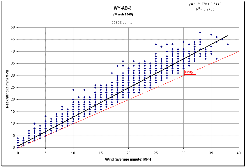
Figure 16.10. Scatter diagram showing the relationship between peak gusts and average winds during March 2005 at Laramie 6.3 NNE
It is interesting to note that the frequency of instantaneous winds on the minute to 60 minute mark shows similar values (Figure 16.10a). Also note that one in 20 hours experienced calm winds during this particular month.
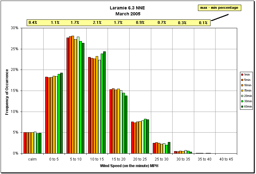
Figure 16.10a. Frequency distribution of wind speed as a function of integrated periods from one to 60 minutes in bins of 5 mph. The frequency of calm winds is also provided.
In Figure 16.11, March’s winds reveal a large amount of variation by day and by hour. During the windiest day in March 2005, I attempted to quantify wind data in more detail. In Figure 16.11a, the actual time series of minute peak gusts and average wind speed is shown. Note that the difference in speeds is greatest with the highest winds as expected from Figure 16.10. The frequency distribution of peak gusts and average wind speed is shown in Figure 16.12. Also note that gusts are more frequent for winds greater than 30 mph than average winds at this speed.
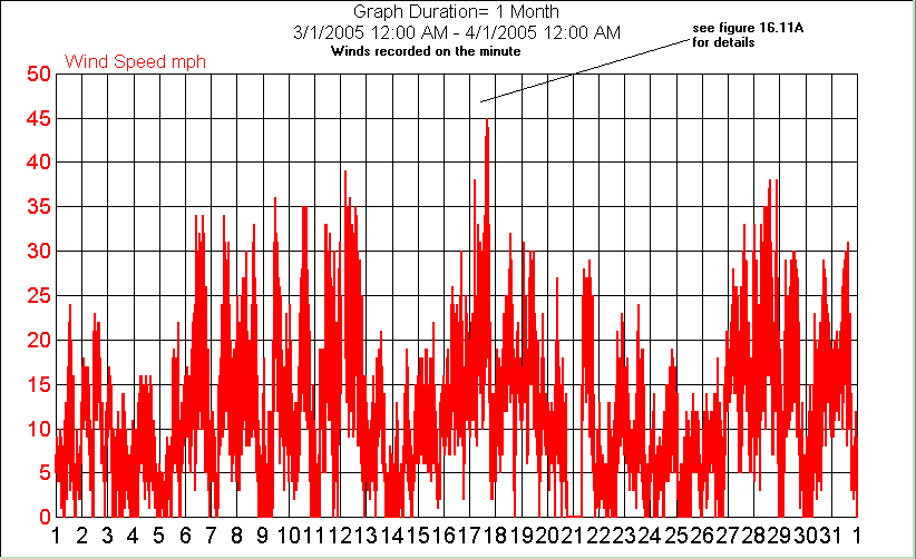
Figure 16.11. Time series of peak gusts and average wind speeds for March 2005
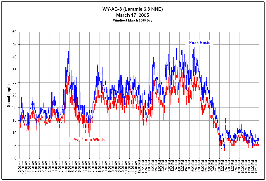
Figure 16.11a. Time series of peak gusts and average wind speeds on March 17, 2005
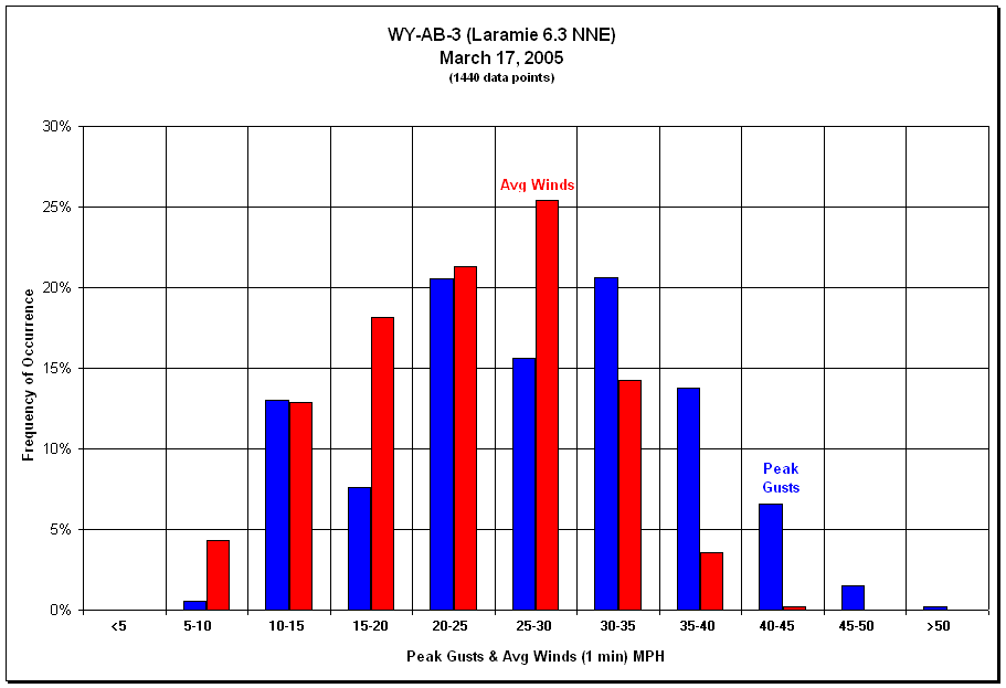
Figure 16.12. Frequency distribution of peak gusts and average winds on March 17, 2005
In Figure 16.13, wind direction frequency for March 2005 shows that the highest frequency of winds comes from the south-southeast to south. While the integrated periods from one to 60 minutes fall within 1.5% of one another in each 22.5 degree bin, the ratio of these extremes range over 15% for eight of the 16 bins. This artifact is cause by bins that have lower overall frequencies. Another words, there is more variation with integrated periods when there is a smaller sampling of data (or occurrences).
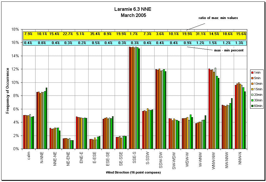
Figure 16.13. Frequency distribution of wind direction as a function of integrated periods from one to 60 minutes in bins of 22.5 degrees. The frequency of calm winds is also provided.
When you receive your weather station, you will need to adjust your barometer to compensate for elevation. If you live near a National Weather Service reporting station, you can use their reading to approximate yours. Since your weather station’s pressure sensor can be affected by environmental factors such as wind and temperature, it might be difficult to achieve an exact matching pressure with these nearby weather stations. However, once you arrive at a close approximation, your pressure trends should follow closely with those of the National Weather Service.
Because pressure changes much more slowly than other weather elements, integrated values over one minute to one hour show nearly identical frequencies when compared in discreet bins (Figure 16.14). The highest frequency (corrected for sea-level) is pretty close to average sea-level (30.00 inches) as would be expected. The near bell shape distribution is also expected since more intense low and high pressure systems are also less frequent in nature.
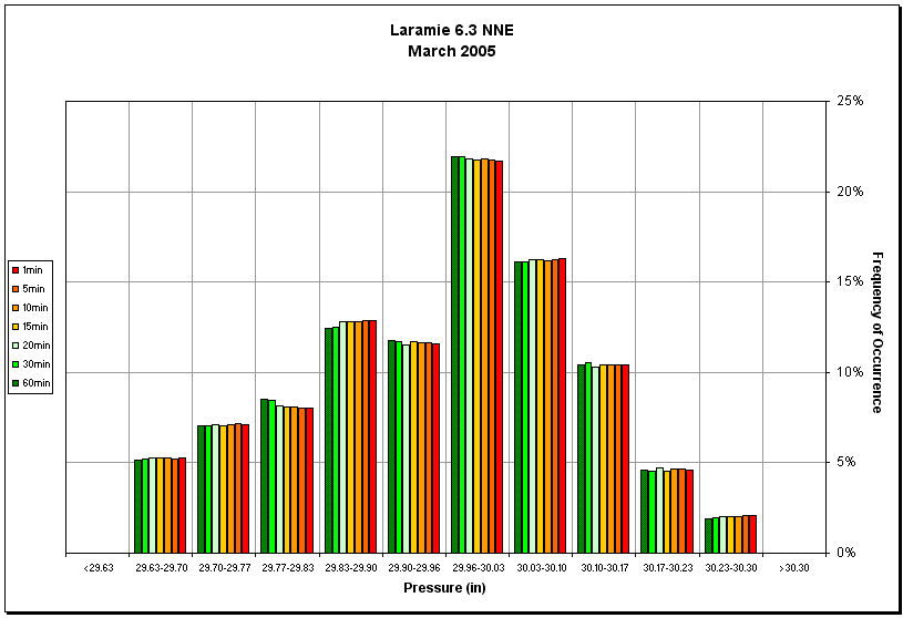
Figure 16.14. Frequency distribution of pressure as a function of integrated periods from one to 60 minutes in bins of ~0.07 inch
Just as is shown in the National Climate Data Center’s Local Climate Data summaries, averages by the hour can be calculated from the data you acquire with your home weather station. In Table 16.C., an example of my March 2005 summary shows that winds peaked around 3PM and that minimum and maximum temperatures occur around sunrise and sunset, respectively. On the other hand, sea-level pressure showed little difference throughout the day. By looking at these types of compiled data, one starts to get an appreciation of the weather cycles for a given area. No wonder why people who live off the land can sense a change in the weather.
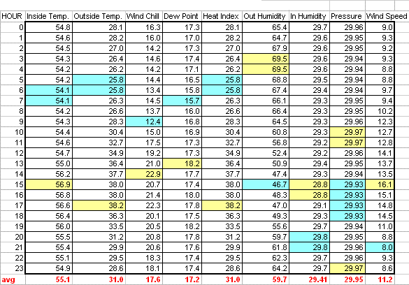
Table 16.C. Monthly averages by the hour for WY-AB-3 (Laramie 6.3 NNE). Highlights show maximum and minimum values during the day for March 2005.
Climate at a local scale is influenced by terrain, ground cover, and how the land is use. For example, in an urban environment, traffic, buildings, and even subways create what is known as a “heat island effect”. In a rural setting, temperatures will be cooler (on average) than in cities as a result of less mass for the sun to absorb and reflect (re-radiated) energy back out into the surround area. Micro climates on the other hand are affected by current weather conditions.
We know that under clear skies with calm winds, temperatures will be colder at night then when skies are cloudy with moderate winds. This is clearly illustrated in Figure 16.15. Temperatures remain quite warm for mid April until winds rapidly drop around 4:40AM. In 30 minutes, the temperature falls more than 10 degrees. Minutes later, the temperature rebounds with light winds but fall further as winds become calm again. Between 6AM and 8AM, the temperature fluctuates in response to winds that are mixing warmer air aloft with the colder air at the surface. However, the dip in temperature between 8:05AM and 8:25AM is counter intuitive based on earlier observations. The lag response time between wind change and temperature change may be the cause of these unexpected observations or that the air near the surface was mixed out to a colder uniform temperature. Finally, the impact of the rising sun causes the temperatures to rebound upward independent of wind speed.
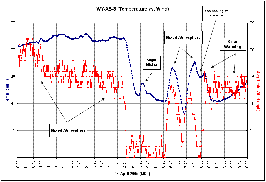
Figure 16.15. Example of shallow stratified near surface atmosphere and how temperature responds to wind mixing
In another example, a dry cold front moved through southeastern Wyoming on the afternoon of April 8, 2005. Storm force winds persisted over the Laramie Valley for nearly 30 minutes (4:23PM to 4:53PM). Figure 16.16 shows that winds recorded on the minute where probably on average in excess of 70 mph based on Figure 16.8 findings. These events usually last for just a few minutes in summertime thunderstorms. The fact that little precipitation fell suggests that the period of long duration strong sustained winds might have been caused by evaporative cooled downdrafts. Having lived at this location for two and a half years and not experienced a similar weather event, I could speculate that the weather conditions that afternoon were quite unusual. Except for a little wind driven dirt on my windows, there was no property damaged.
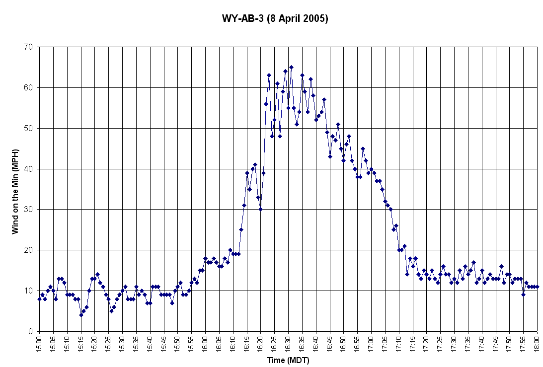
Figure 16.16. Example of a high wind event on April 8, 2005, 6.3 miles north-northeast of Laramie
When an active cold front moves across an area, there is usually precipitation in the vicinity of the front, rapid falling temperature, rapid increase in pressure, and wind shift. In Figure 16.17, this was clearly the situation on the morning of May 8, 2005 starting around 1:30AM.
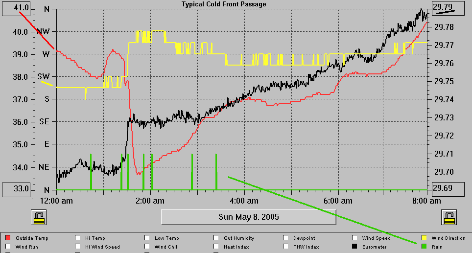
Figure 16.17. Example of a cold front passage at Laramie 6.3 NNE
| ← Previous Chapter | | Table of Contents | | Next Chapter → |
State Climate Office | Water Resources Data System
Last Modified: Friday, 23-May-2025 08:49:40 MDT